
Tips for Crochet and Knit Pattern Tester Photography: Part 1
If you want to be a great crochet pattern tester, good photography is essential. Not fancy or super complicated photography - just quality, clear photographs showing the final product (or in progress product) with good composition. Photos that make the product look beautiful and highlight it’s best attributes.
When I was pattern testing (which I still do occasionally because it’s fun!), I always tried to give designers quality photos that were useful. Now that I’m a pattern designer, I really appreciate the effort and time my testers put into giving me those quality images. This blog post has a ton of useful information for both crochet and knit products and pattern testing photography essentials, so keep reading!
Part 2 will include tips on photographing large and small objects as well as modeling your handmade garments and accessories.
In this blog post, I will refer to the finished crochet or knit item as the “product” or “subject” as you can also use these tips to photograph other objects such as yarn or a finished crafted item.
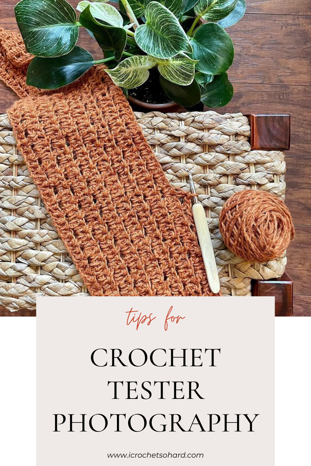
If you can’t read the entire post now, or want to refer back to it later, use the image below to Pin it. If you find this information useful, please share it with your tester and designer friends to use as a resource.
*Some of the links in this blog may be affiliate links, which means if you shop through the link, I make a small commission at no additional cost to you. These purchases support my small business, so thank you!*
Here are some terms you might not be familiar with if you’re just starting to test patterns:
Flat Lay Photos - Photographs of a product/subject taken when the item is laying flat on a surface, sometimes in a composition with other items or textures
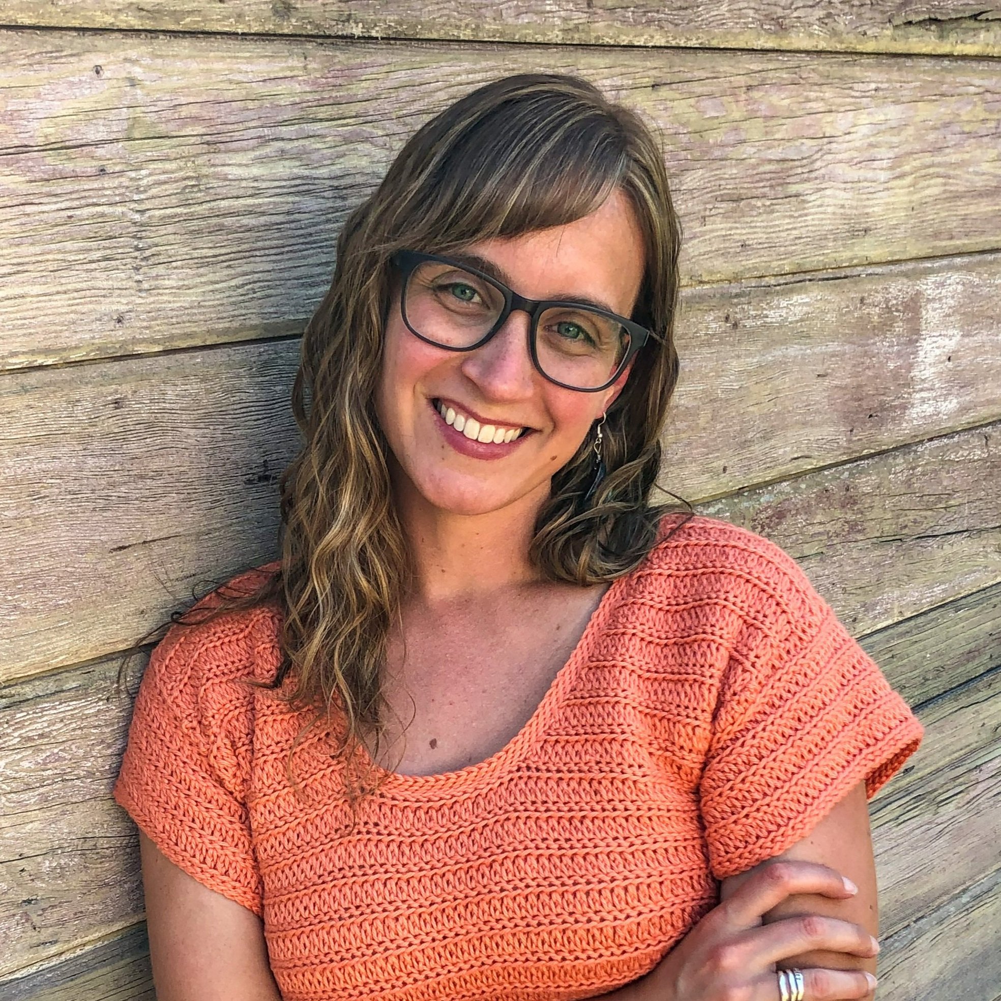
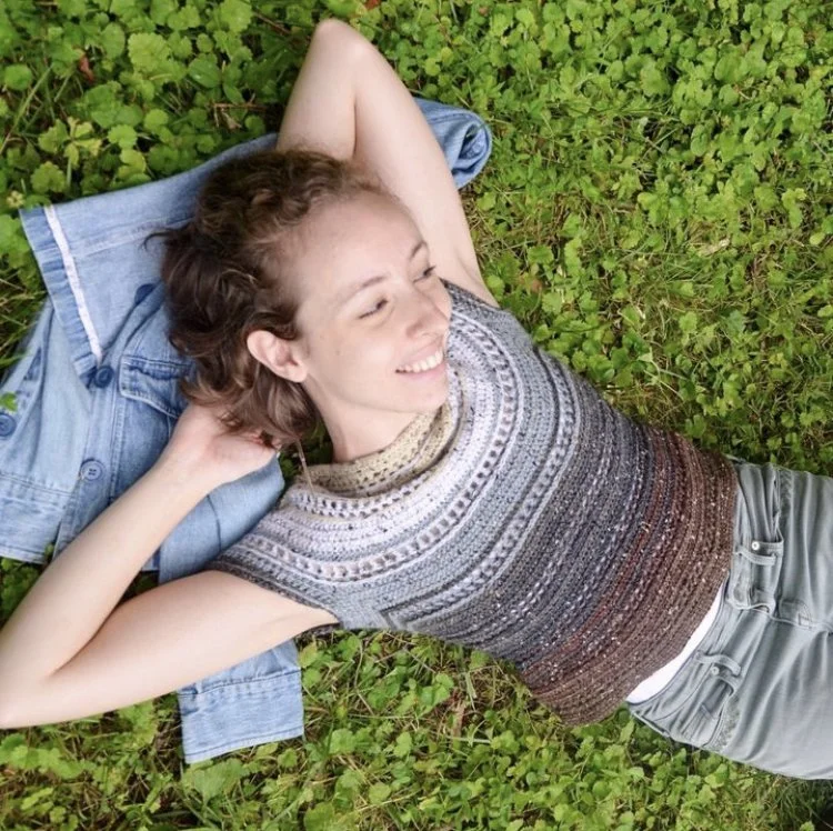
Modeled Photos - Photographs of the product (usually a garment or accessory) on an actual person
Props - Any items that are used in the photograph, in addition to the product itself, to enhance the photograph
Negative Space - The space in the frame around the product/subject of a photograph that is uninteresting, bland, or even empty/blank
Indirect light - Light that is not shining directly on you, usually filtered by something. This would refer to being in the shade or under a cover when it’s sunny outside, being next to a window when there is daylight outside, or being outdoors on a day where there is light cloud cover and the sun is not shining directly on you. If you are indoors, it could mean being far enough away from the light source so it’s not reflecting or bouncing directly off of you or the product.
FLAT LAY PHOTOGRAPHY TIPS FOR MAKERS
Here is a basic description of Flat Lay Photography:
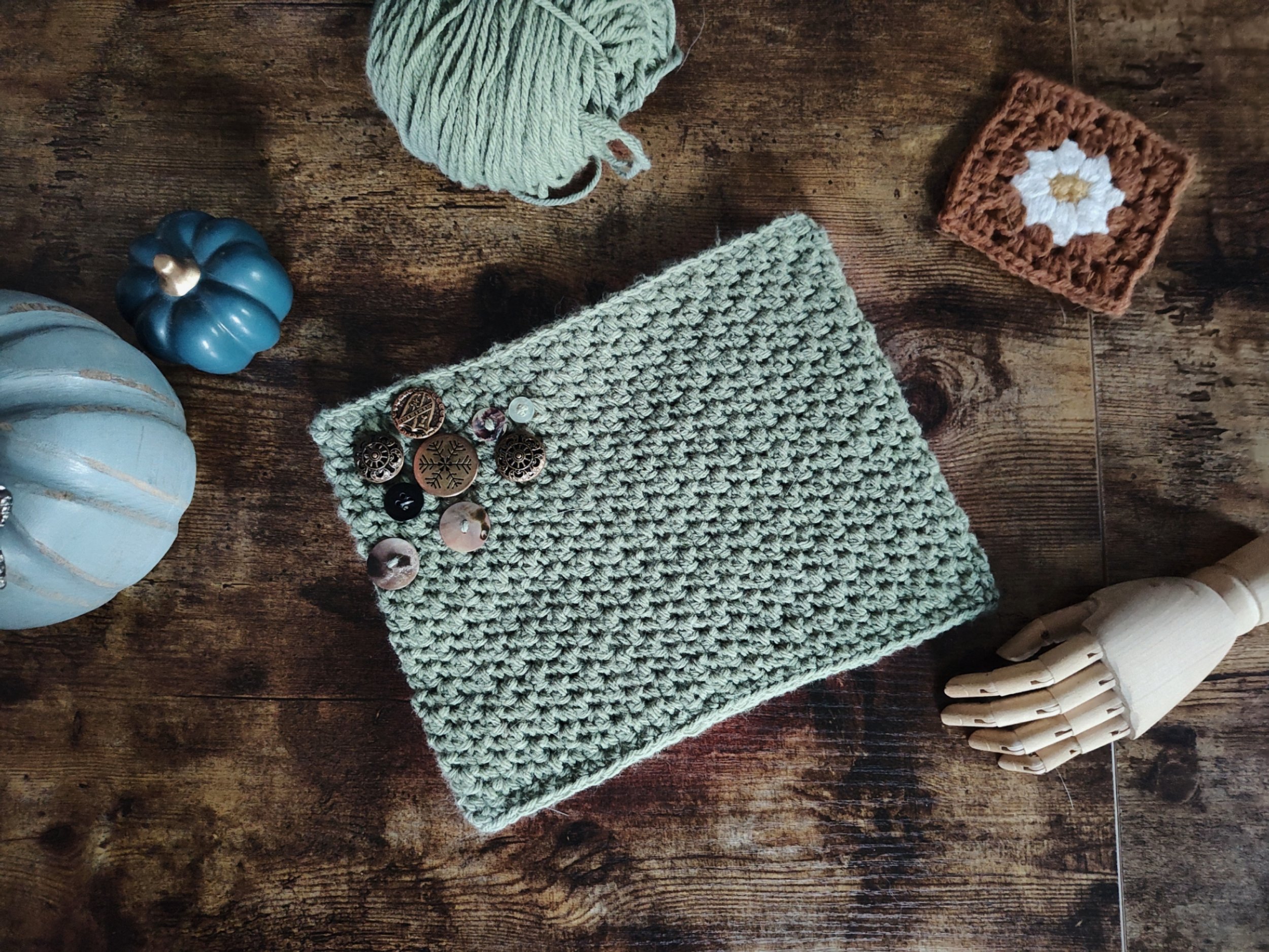
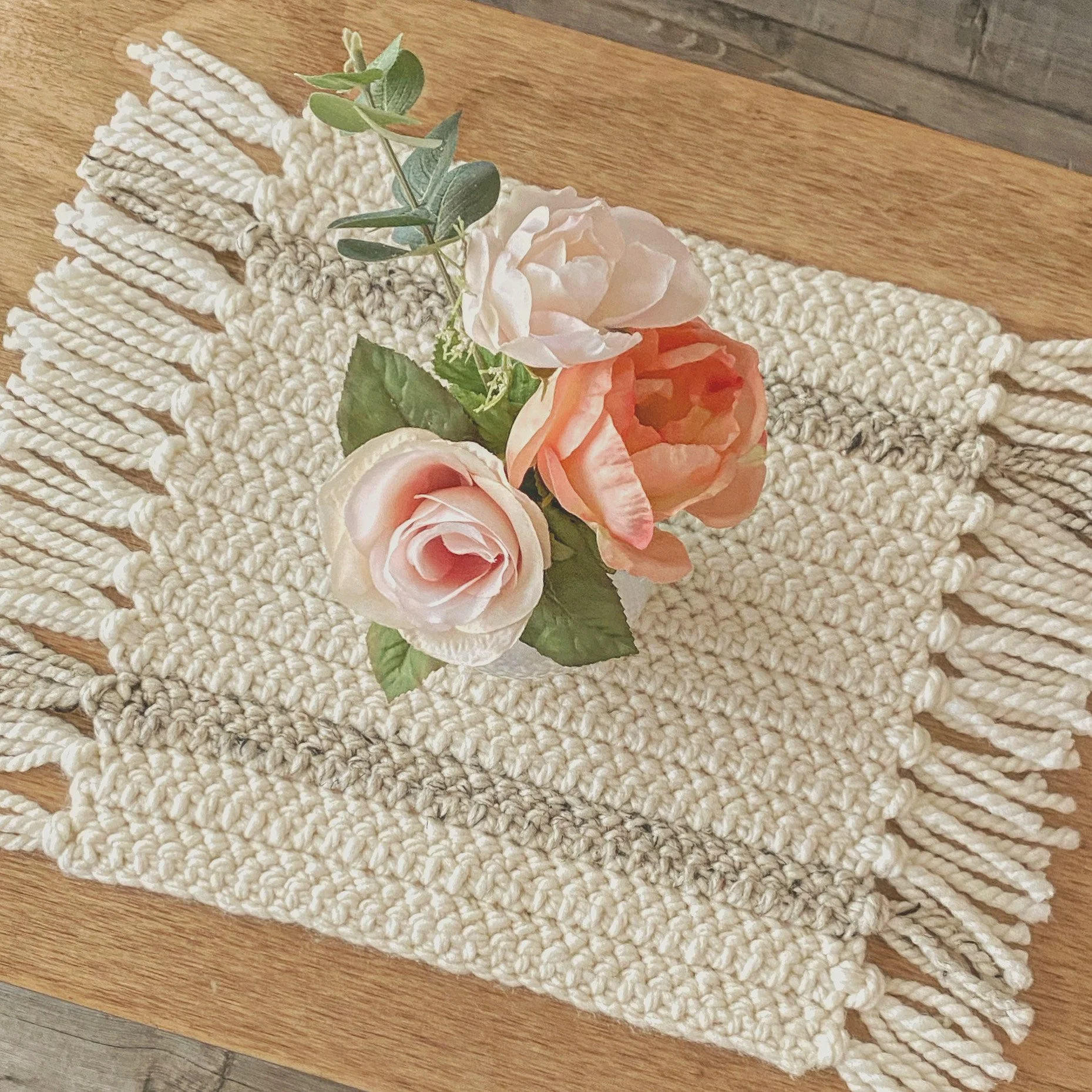
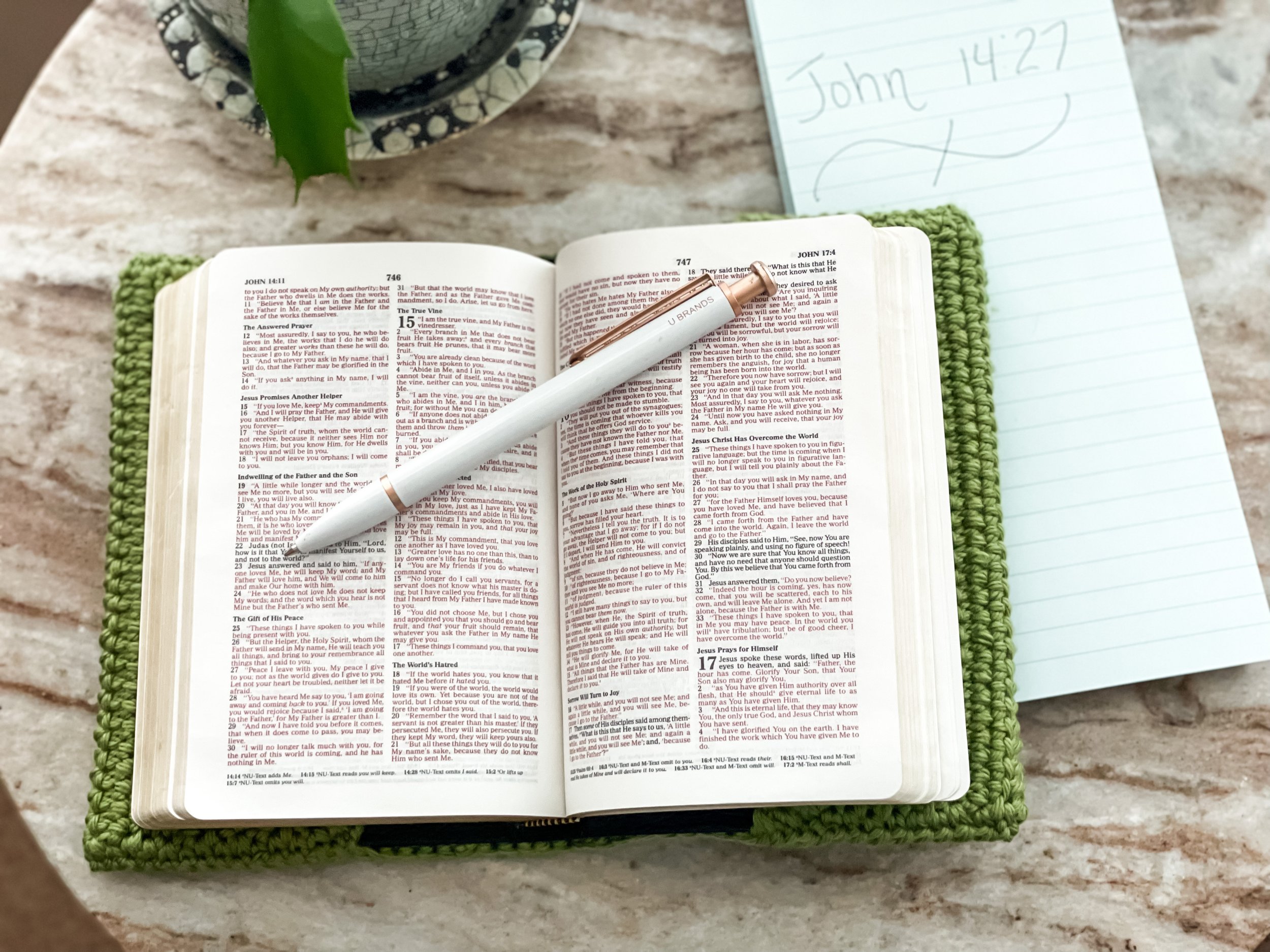
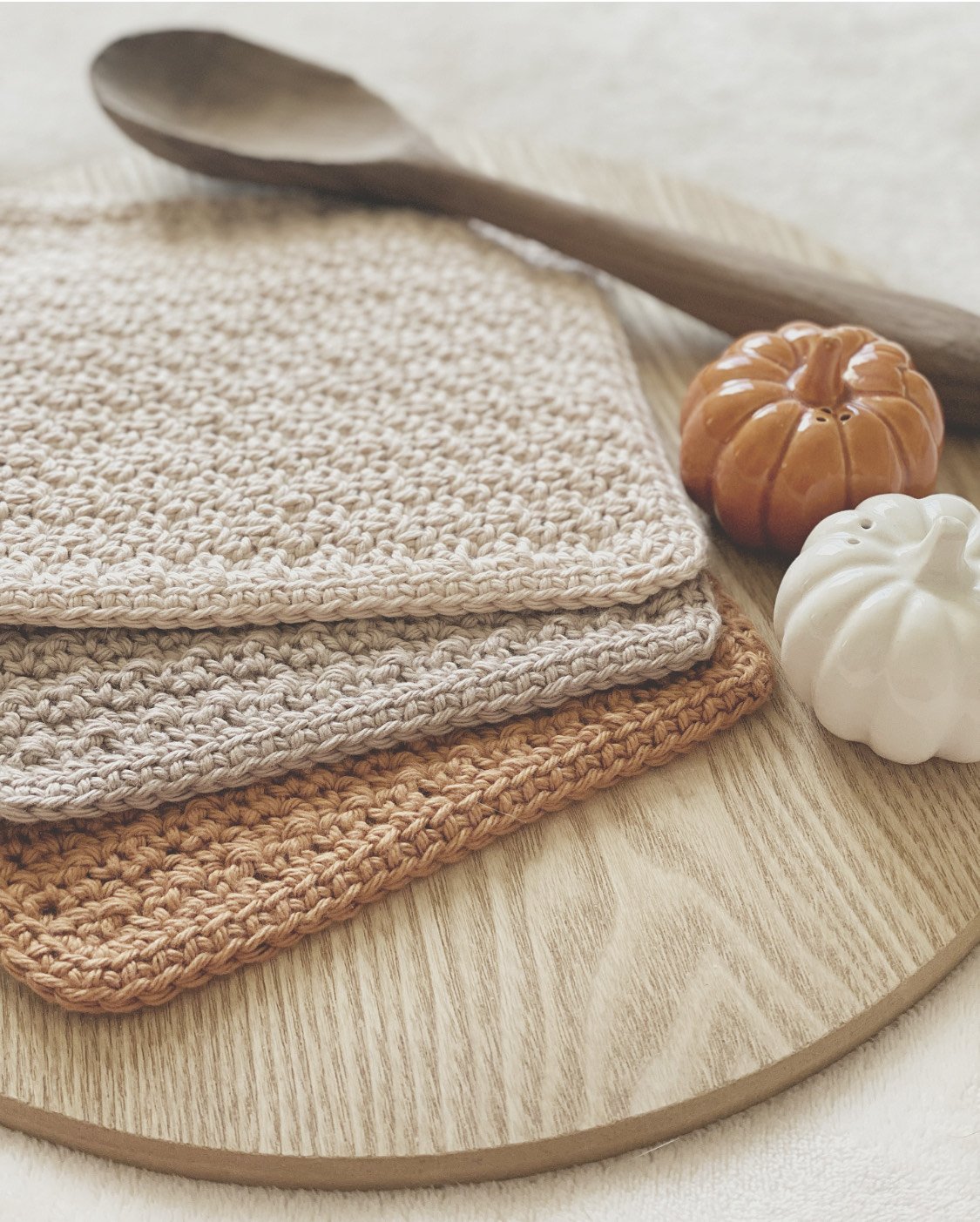
Take a few photos of your subject laid out on a flat surface. Choose a few items as props - decorative beads, yarn, pretty crochet hooks, small seasonal items like pumpkins and leaves, dried or fresh flowers, a snowflake ornament, a boutique bar of soap, etc. Place these things around your subject so just part or all of the prop items are in the frame and the product is still the main focus. This is called a "flat lay." Crochet and knit designers usually ask for these (and love to see them) with an item that isn’t worn on the body, and sometimes in addition to modeled photos.
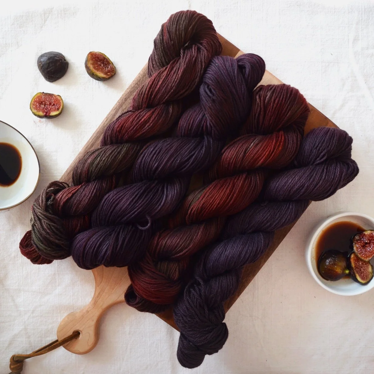
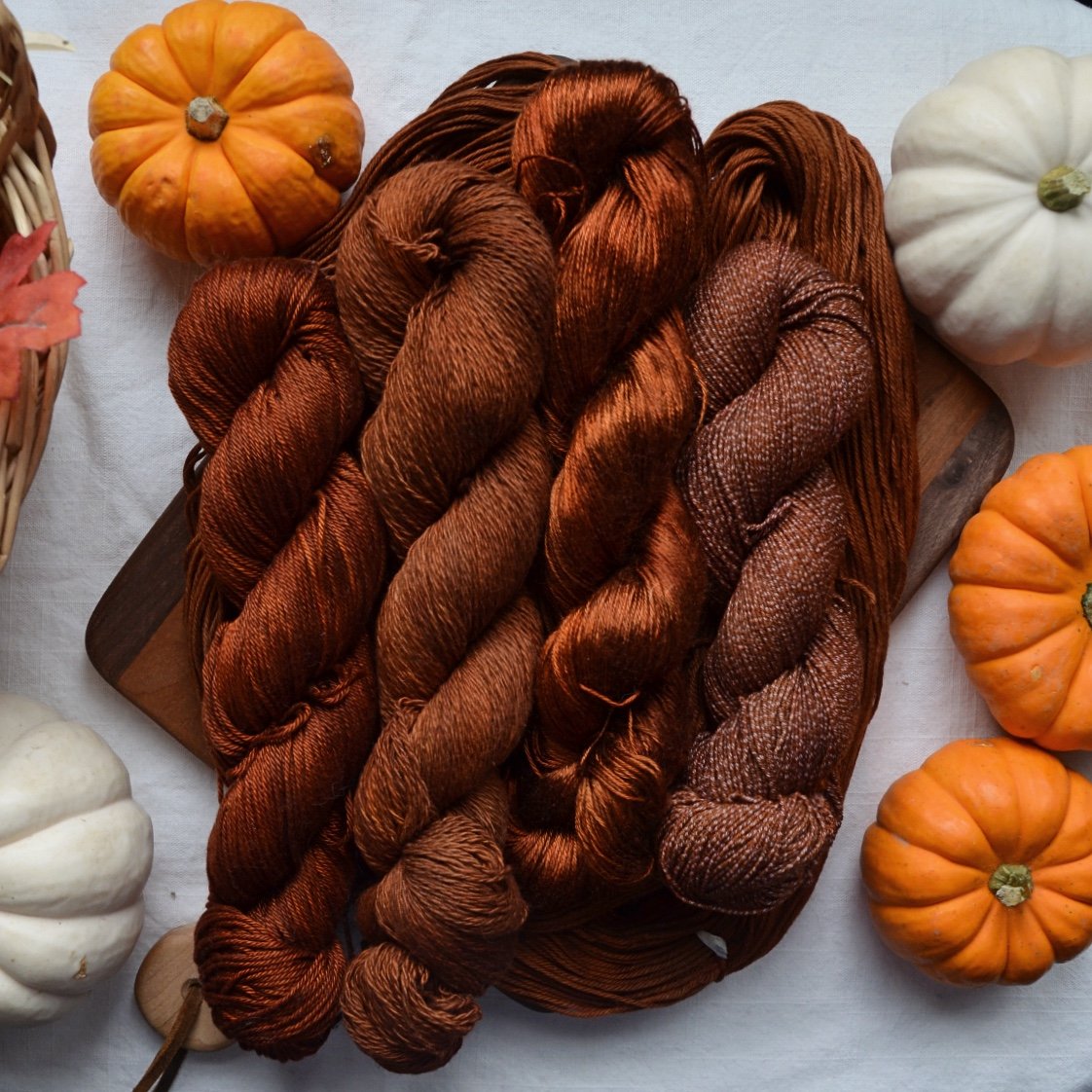
I asked Lyla Lawless of Terrapin Fiberworks (delicious plant-based hand-dyed yarns, crochet and knit patterns) to contribute some tips about flat lay photography, because her photos of yarn and crochet/knit projects are stunning. Some of my favorites were from her Farmer’s Market Collection of hand-dyed yarn featuring a wooden cutting board and actual food and herb items as props! Here are some examples of photos and her tips too.
SPACE AND PROPS FOR MAKER PHOTOGRAPHY
This is a photo provided by Lyla, and her first tip was about using yarn as a prop: “Sometimes you just don't have great accessories lying around and [yarn] helps the photo feel more fiber crafty.” This photo of an in progress knitted sock is a good example of how to use that tip. She continued, "You take a ball that still looks nice and curl the tail around in a sort of loopy, artistic way and that fills some of the negative space in the shot.” You can see how the sock is still the subject of the photo but other items fill the negative space out in a good way.
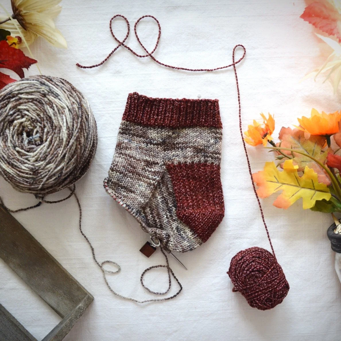
Lyla also said: “I like to have a relatively even spread of items across the shot so it feels visually balanced, but you can play around with that, putting more items on one side or the other to create more weight and gravity and make the eye want to travel through the photo in a certain direction.”
There are many other “crafty” items to use as props such as cute embroidery scissors or pretty wooden hooks. I’ve also unwound a pretty measuring tape and used that as a prop. Lyla says “props don't have to be fancy or expensive, but they should be relatively unobtrusive and complementary to what you're trying to photograph.”

More about sourcing props from Lyla: “The pine boughs in [one] shot were snipped off some curbside Christmas trees that my neighbors set out after the holidays, and the plant in the reader/balsam/library shot is just one of my slightly less sad houseplants! Greenery is always a great idea if you don't know what vibe you're trying to go for. It softens the shot to have something natural filling in the corners of the photo. You can also use artificial greenery (grab a few things when Michaels has a sale!), it is impossible to tell the difference in a photo!” I can 100% attest to the fact that you can create beautiful photographs with thrifted or free items (including things from your yard or garden).
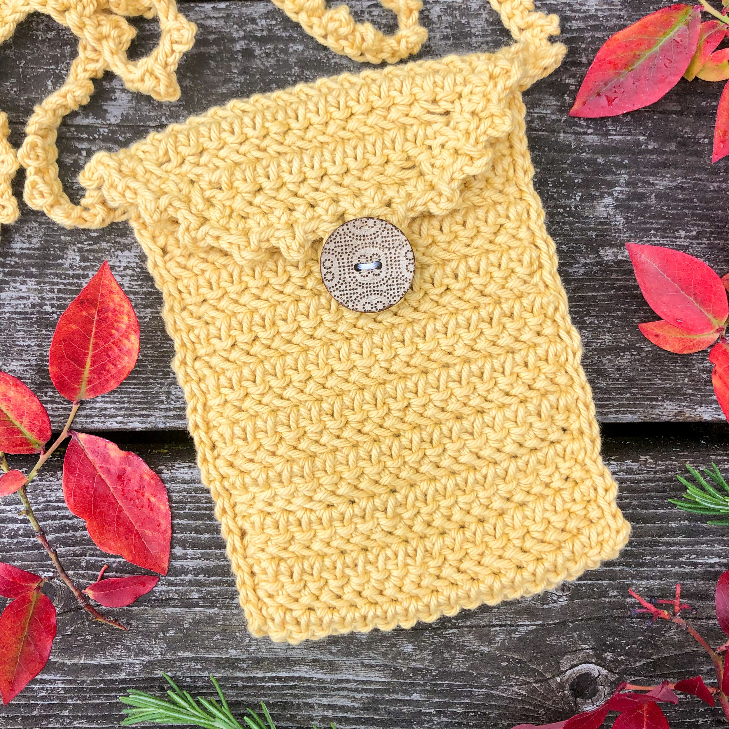
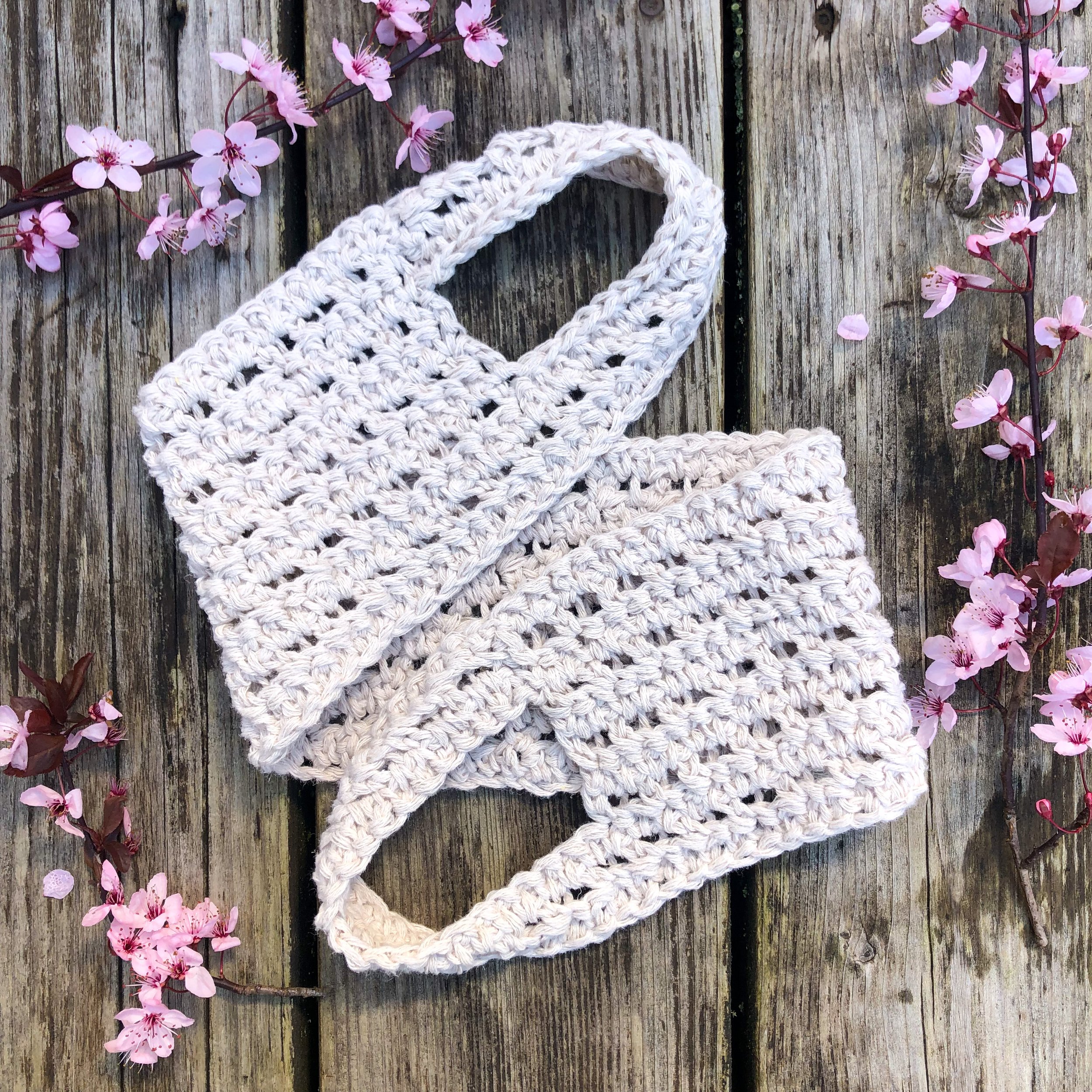
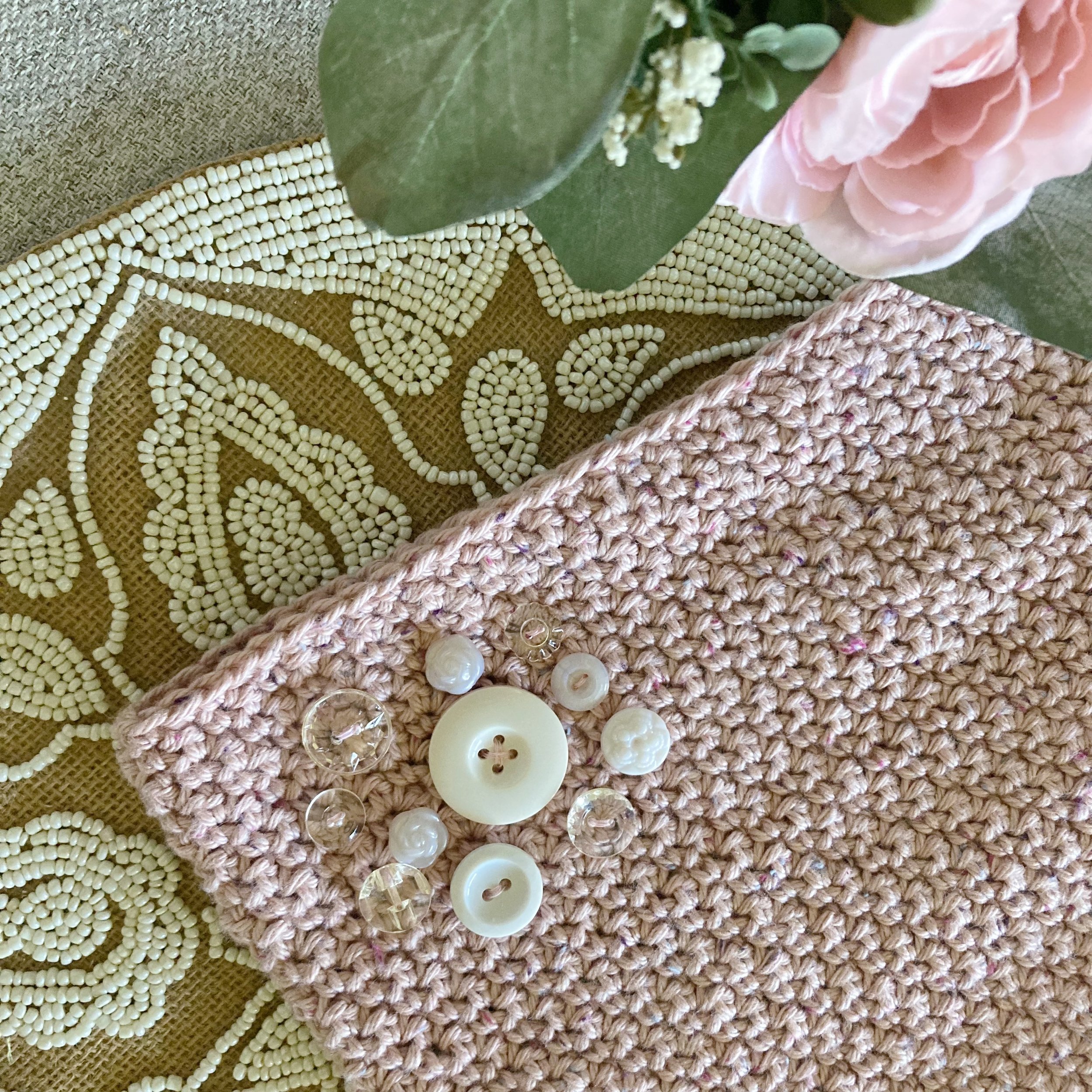
The photographs below turned out to be some of my favorites, taken on top of some old deck boards in my backyard. The small purse (Angela Phone Pouch) features branches from my blueberry bush (it was fall) around it, and some rosemary from my herb garden. The back scrubber (Joanna Back Scrubber) photo features blossoms from my plum tree.
“Props don’t have to be fancy or expensive, but they should be relatively unobtrusive and complementary to what you’re trying to photograph.”
You can use anything for a background as long as it’s the color and texture you want in your photo. I have used sheets, blankets, my tile floor, the deck boards, my couch cushions, my bedspread and more. I do not use shiny or glossy items as a background, been there, done that and it doesn’t usually turn out well because of glare, highlights and reflections.
When choosing props, consider incorporating natural elements (even if they are faux), like Lyla mentioned. Several of my testers use props found in nature, or suggestive of nature (see gallery below). This is a concept my cultural anthropology professor lectured about in college but I can’t remember what it’s called… Sorry Dr. Lou! A composition that includes both man-made elements and natural elements is something we instinctively attempt, and it really does bring some kind of feeling of balance to these photos.
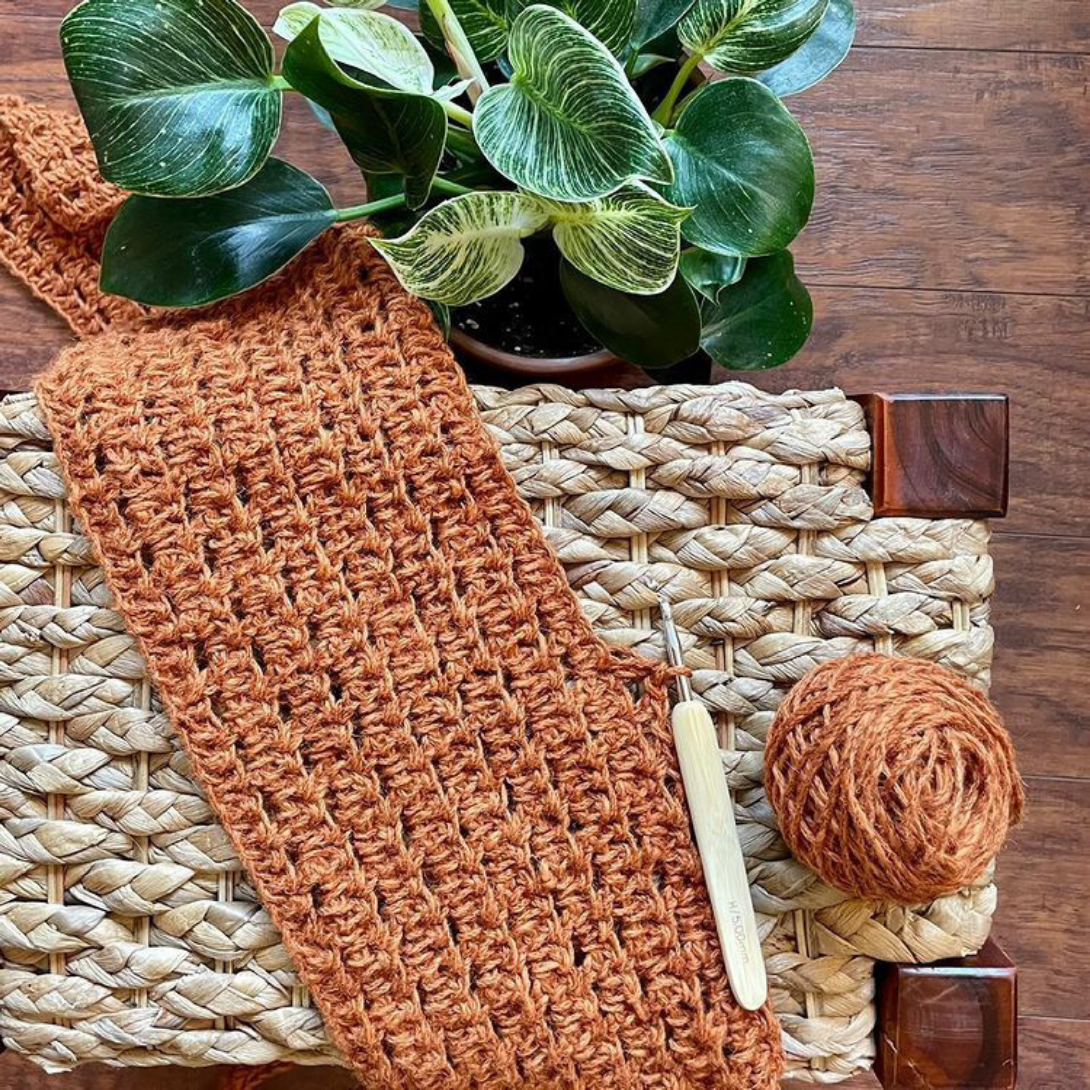
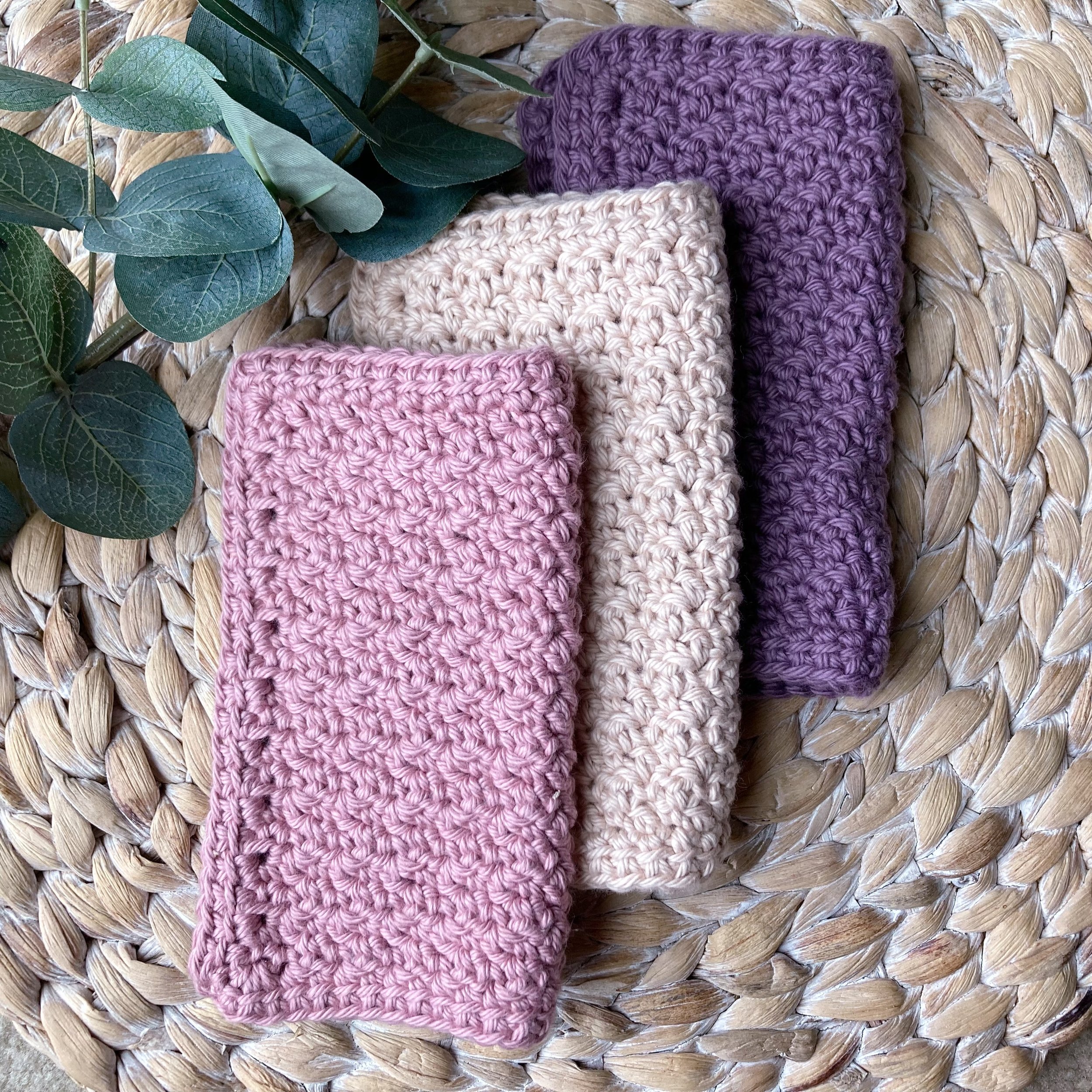
The above photos were all taken by my testers (used with permission), and I think they are great examples of flat lay photography. Everyone definitely has their own style and mood, and I love the variety and creativity of the photos! One of the most exciting things as a designer is to start getting those beautiful photos back from your testers and see how they brought your pattern to life with their creativity and skill.
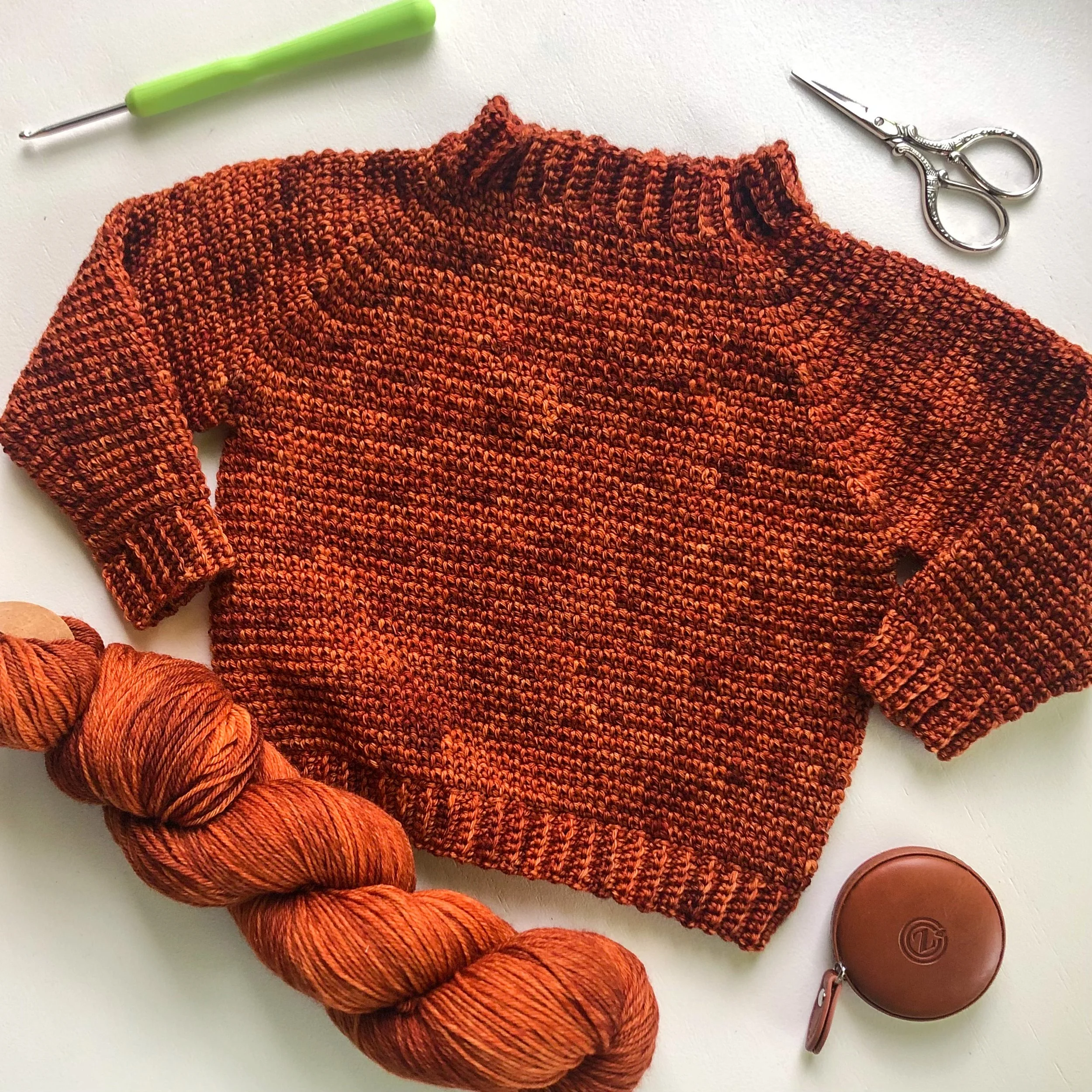
Also, take notice of how angles are used in these photographs. Using straight as well as slanted angles together in the photo gives it more visual interest. Try tilting your object to a few different angles to see what looks best. From Lyla: “Having a mix of angles in the shot helps it feel balanced.”
You can use different shapes to create interest as well. If your object is a square or rectangle, try finding props that are circular or organic in shape and vice versa. In the photo below, I incorporated a half circle and my item is at somewhat of a straight angle. Some people seem to have an instinct that helps them do this kind of staging, but you can learn this skill also. I recommend lots of practice! Some of my best shots have been a result of trial and error. If this is all feeling a little overwhelming, there is a printable cheat sheet at the bottom of this post.
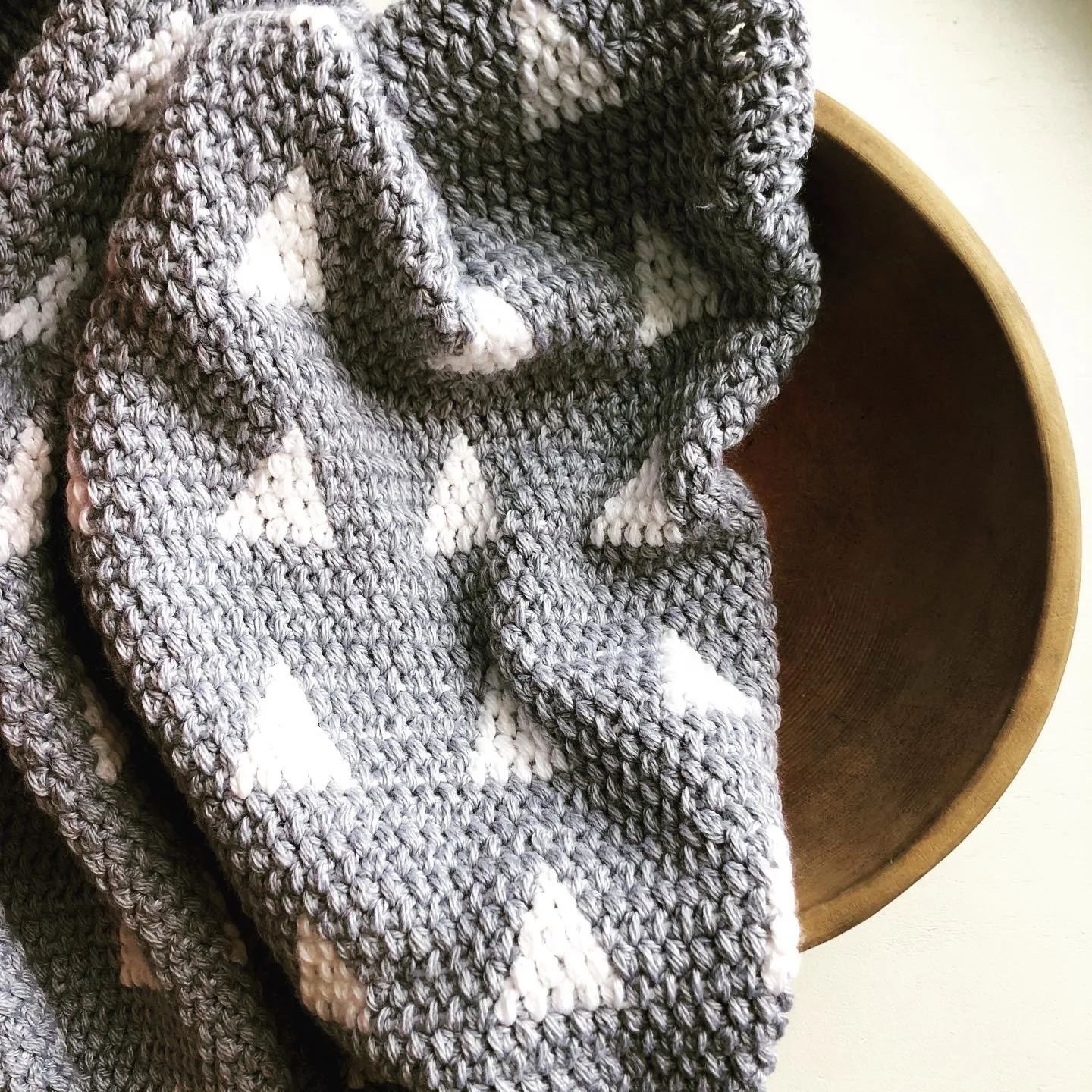
In most of my photos, I prefer simplicity. I use very few props and try to put the focus on the texture of the fabric. I do, however, like to grab an item or two that suggest the purpose of the subject and/or contrasts with the color or texture. I crocheted this blanket in 2020 and I used a very basic iPhone 8 and natural light coming through a large window. The background is the window seat. I didn’t do much editing to these indoor photos.
I also left room around all edges for cropping into a square. This has remained one of my favorite crochet photographs, mostly because of how simple it is and how it shows off the texture of the blanket to perfection. The prop is a large, primitive wooden bowl that I picked up at a strange antique store in the middle of nowhere on a trip back from the Oregon coast.
It’s good practice to leave some head room and space around all the edges in case the designer wants to crop the photo. Most designers use tester photos for many different purposes. One is for item listings on Etsy, Ravelry and other sites. On some sites, all the photos and/or preview thumbnails are converted to square shape. Also, this is a typical photo size/shape on Instagram. That means if your photo is tall and skinny (portrait orientation) or wide and short (landscape orientation), part of the photo is going to get cut off no matter what. Lyla says: “If you're shooting on your phone, I would shoot in ‘square’ mode so that you can see right away what will be in the photo and what won't.”
“It’s good practice to leave some head room and space around all the edges in case the designer wants to crop the photo.”
I have some wonderful testers who leave space for cropping in their photos, it’s so wonderful to be able to use their photo across sites and apps and to make fun Pinterest Pins with them too. I have some testers that send me photos that are 16:9 ratio (the proportions of a Tik Tok video), and when I try to use them on some of these websites, they are almost cut in half! That means I may not be able to use the photo at all, or that I have to cut off a large portion to turn it into a square.
One more thing - please don’t watermark photos you are providing to a designer! I am not able to use images with logos or watermarks on some pattern listing sites. You can do whatever you want with the photos on your own Instagram account, website, etc., but watermarking or branding can render a beautiful photograph unusable for the designer.

Photo by Lyla Lawless
Don’t you just want to reach out and squish the yarn? Here’s what Lyla had to say about this particular photo: “[This photo is of ] yarn I was selling last October, so I wanted a rustic fall look. I used a wicker basket I already had in my house, some leaves and acorns I grabbed out of the backyard, and a turtle-shaped plant tray I got from my neighborhood Buy Nothing group (since we're Terrapin Fiberworks). The map and crochet hook I did purchase on Etsy, but I use them in my fall photos every season because they have that warm and sort of rustic looking tone.”
PHOTO EDITING APPS/SOFTWARE AND PORTRAIT MODE
Here’s another tip from Lyla: “I would get comfortable with photo editing software! You don't need nice photo equipment. I happened to already have a DSLR so I use that, but I edit my photos with a free online software called Pixlr. I know there are similar things for iPhone and Android, so if you only have a phone camera, I would suggest sticking with that and finding a good app to go along with it. Modern cameras are all really great, but they still aren't human eyes, and they sometimes have trouble with high contrast subjects, certain colors, or white balance. The things I usually tweak are raising the exposure/brightness/highlights (photos nearly always start off too dark for social media!), sometimes deepening blacks & shadows, and often moving the tint or white balance a little cooler and purpler since my camera tries to make things weird and yellow-green. Honestly, you can also click "auto-adjust" and call it a day. A lot of the things you would do in a photo app with these finer tools are adjustments to your own personal photography style and you may not want to bother, nor should you feel like you have to.”
“Modern cameras are all really great, but they still aren’t human eyes, and they sometimes have trouble with high contrast subjects, certain colors, or white balance.”
In my experience, there are several colors that just don’t look the same to my eye vs. the camera. One of those is gold yellow/mustard yellow and it’s one of my absolute favorite colors. I have several samples of my patterns that I’ve made with gold/yellow yarn and it just never looks quite the same on the screen. Another shade is coral/persimmon types of orange. It’s so helpful to have editing software available to adjust the tint of the photos to match what my eye is seeing.
I use the free edition of Lightroom (an Adobe Photoshop app) on my iPhone for all my photography (because I take photos on my iPhone SE) and it works really well. I can brighten things up, crop, use an autocorrect feature, and manually adjust colors if things are too warm or too cool. You can pay for an upgrade to add more filters and special effects but I’ve never needed any of those things. Just bumping the brightness up a couple of notches can drastically change how your photo appears on social media and/or listings.
If you don’t know how to tell if your photo is more purple/blue or yellow/green tinting something, evaluate how the whites appear. Do they look purple or yellow? Blue, pink or green? Compare the photos side by side to another photo on your phone/camera that contains what you see as a true white. Normally that is a good indicator of how to adjust the tint. This is a really good skill to practice in your down time, it took me lots of playing around to successfully use the color correction tools. And remember - it’s not always necessary. One of the only times I really have to rely on color correcting is with pictures taken in weird light such as a snowy day, or photographing certain colors.

One more nugget here… if your phone has Portrait Mode, use it!! Play around with this setting so you can see how it enhances your images by bringing the subject into focus and the background into fade/blur. This is applicable for product photography as well as modeled photography. Portrait mode works best with a layered photograph where there is a subject in the front and objects or scenery in the background. It really doesn’t do anything when things are one dimensional or fairly flat and you have to be relatively close to your subject(s). I’m going to show you two photos below, one using Portrait mode and one without.

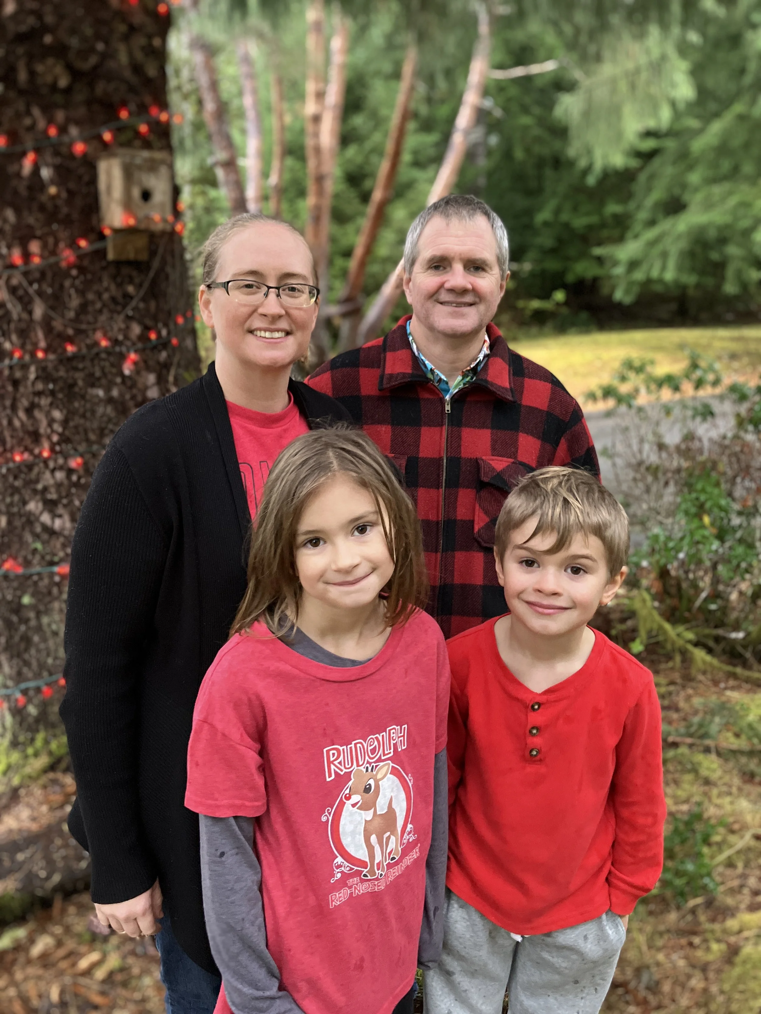
Just take a second and notice the first photo (left) appears more sharp, but the subjects (the people) don’t stand out as much. In the second photo (right) where the background is more blurred, the focus is definitely on the people and you don’t notice the background as much. It looks more like a professional portrait than a point and shoot with your phone. You also want all the objects (or people) you want focused on to be on the same plane as far as depth is concerned. Otherwise, you could end up like my brother-in-law and be just slightly blurry if you’re behind everyone. Thank you to my lovely subjects, my sister and her family!

Photo by Lyla Lawless
LIGHTING
My best tip is to use natural lighting, but indirect light. Indirect means the sun isn't shining directly down on you. Sometimes when it's really bright outside, the best place to get photos is the shade. Colors look very vibrant and true to life with this type of light. If you have to take a photograph indoors (which happens due to bad weather, etc.), try to stand next to a large window where there is natural light coming in. With synthetic lighting (light bulbs or camera flash), you will get colors that look very different than they do to your eye and you’ll get glare and harsh angles/highlights. Lighting is the number one difference between usable and unusable photographs that testers have provided to me. For reals!
“It is worth waiting for strong, indirect sunlight”
From Lyla: “…light is absolutely king! The photo will not come out well if the light is bad. You're really wasting your own time if you try to shoot photos at night, under indoor lighting, on a gross rainy day -- it is worth waiting for strong, indirect sunlight. My setup is a TV tray beneath the sunniest window in our house. Direct sunlight is not good because it'll usually just throw weird shadows onto your flat lay, so I like to shoot around 2pm when the sun is about to come around the house. If you don't have a space like that to work with, you can take the shoot into the actual outdoors instead!”
I’m going to second the opinion that it’s 100% worth it to wait for good light. I’ve received many photos from testers who waited until the last minute to take them and it’s nighttime and they can only take photos indoors with artificial light. These are barely usable or unusable photos. So my tip here is if you are a crochet or knit tester, give yourself a cushion of time after finishing the project in order to photograph it in good light.
Here’s what Lyla had to say in a comparison of lighting in these two photographs: “[A] ‘bad’ example is our November yarn club colors, which I had to photograph on a cloudy day kind of late in the afternoon because I was pressed for time. You can see that the photo lacks luster and depth because I didn't have enough light to communicate the texture of the fibers. My camera actually struggled with focusing as well due to the combination of low light and dark subject matter. In comparison, I have a shot of our October club color Pumpkin, which has a similar depth of shade to the November colors so would present the same challenges in terms of camera focus and getting that depth and texture to really come through. But because I did that photoshoot at my usual time of day with proper light, the photo has this lovely depth and character, and the yarn pops! They both went through my exact same photo editing process, and I used my DSLR for both. The only difference between these two photos was that lighting issue.”

To wrap this all up, I have a free download so you can remember the key points! It’s hard to get everything just right, so don’t worry if your first attempts feel a little awkward. Thank you so much to Lyla for contributing so much valuable information to this post, it was so fun to have her tips and photos to share with you all! Subscribe by email so you don’t miss Part 2, coming soon! It will contain tips for large and small object photography as well as how to take great modeled photos of your makes. I have some great contributors that I can’t wait to introduce you to. Download your cheat sheet by clicking here.
Follow me (@icrochetsohard) and Lyla (@terrapinfiberworks) on Instagram for pattern testing opportunities. I have free crochet patterns here on my blog and patterns for sale as well. Thanks for stopping by and let’s stay in touch!